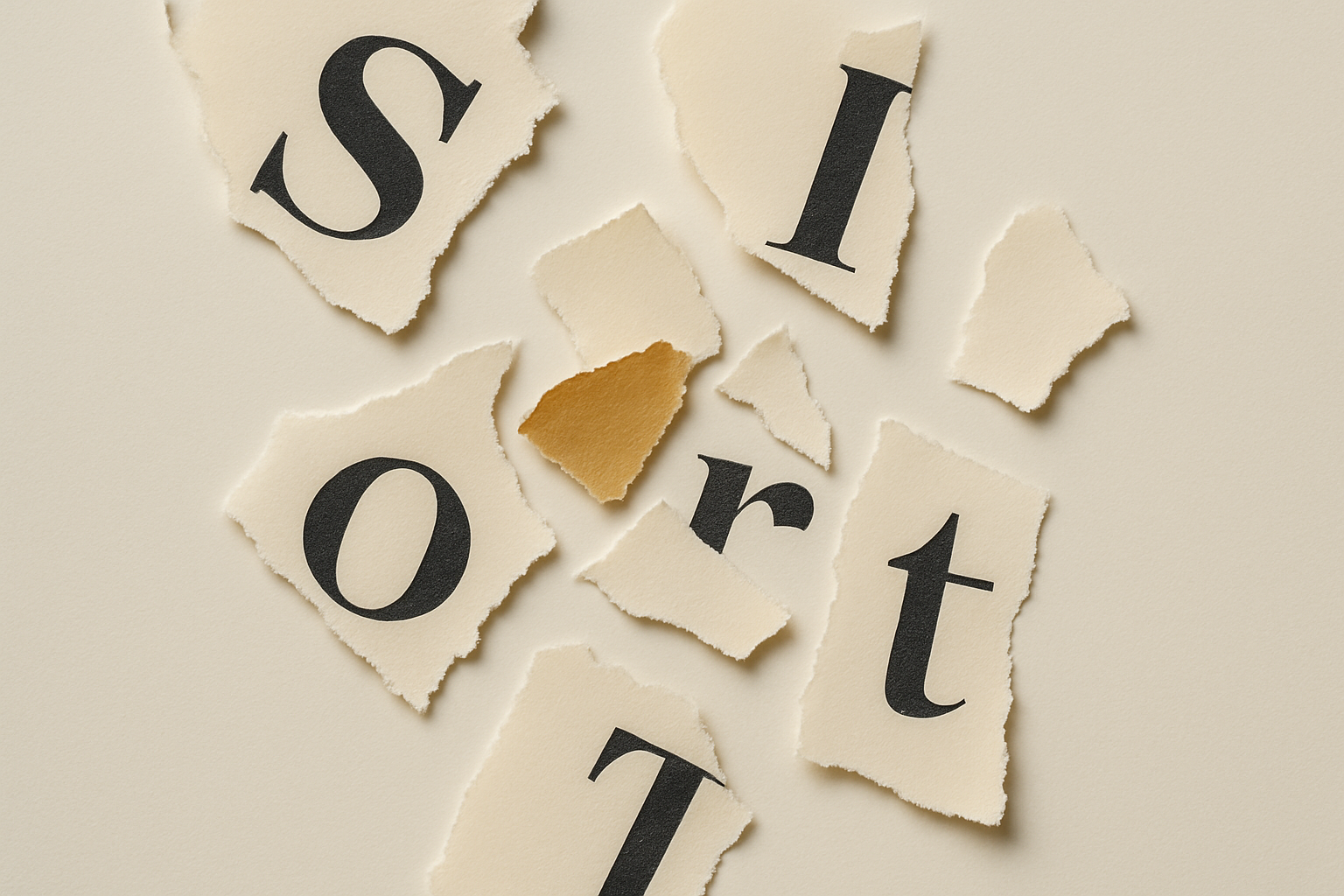
The Ransom Note Problem: Why Everything You Produce Looks Like It Came From Five Different Companies
A prospect gets your proposal on Monday. Your invoice on Friday. A follow-up email the week after. Three documents, three fonts, two versions of the logo, and a tone that swings from stiff to chatty and back. They don't say anything. They just quietly wonder whether the left hand knows what the right hand is doing.
That's the ransom note problem. Cut a letter from one place, paste a word from another, and the finished thing tells everyone exactly one thing: nobody here is in charge of how this looks.
The customer notices before you do
You see your brand from the inside, one piece at a time. The proposal on the day you send the proposal. The invoice on the day you raise it. Each one looks fine on its own.
The customer sees them stacked up. And people are pattern-matching machines — they can't help it. A mismatched set of touchpoints reads as disorganised, and disorganised reads as risky. Nobody thinks "different font, therefore untrustworthy" in those words. They just feel a small hesitation and can't say why.
For a business asking someone to hand over money, that hesitation is expensive.
Why it happens — it isn't carelessness
The people making your documents aren't sloppy. They're guessing, because there's nothing to stop them guessing.
Sarah writes the proposal and picks the font she likes. James does the invoice from a different template he found somewhere. The VA writes the follow-up and matches the tone to their own instinct. Every one of them made a reasonable call. There was just no shared answer, so they each invented their own — and three reasonable calls in three different directions is exactly what a ransom note is.
The fix isn't "try harder to be consistent." You can't hold consistency in your head across five people and forty documents. The fix is to make the decision once, write it down, and point everyone at it.
What "written down" actually means
Not a brand book. One reachable answer to the questions that keep getting re-guessed:
- The logo — the correct file, and where it lives, so nobody grabs the 2019 version off an old deck.
- Two fonts. One for headings, one for body. Named, with a link to where to get them.
- Three colours, with the hex codes, so "our blue" stops being three different blues.
- How you sound in one line, plus five words you'd never use.
That's the spine of a consistent brand. It fits on a page. The point isn't the page — it's that "which font?" stops being a question anyone has to answer twice.
A quick test
Pull the last five things your business sent a customer. A proposal, an invoice, two emails, a social post. Lay them side by side.
Do they look like they came from one company? Or five?
Most owners have never looked at their output this way — as a stranger receiving it in sequence, rather than as the person who made each piece. Do it once and the ransom note jumps out. So does the fix.
Fixing it is cheaper than living with it
You don't need a rebrand. You need to end the guessing. An hour writing down the logo, the fonts, the colours and the voice, put somewhere everyone can reach, and the next proposal matches the invoice matches the email.
The prospect who used to feel that small, unnameable hesitation? Now they just see a business that has its act together — before you've said a word about how good the actual work is.
That's what consistency buys. Not prettier documents. A customer who trusts you slightly more, on every single touch, without knowing why.